The Challenge
Stemming from the assessment scheme from the International Society of Typographic Designers (ISTD).
The brief asked to design a typographic system to answer the theme of The Space Between... to express a narrative, engage an audience and embrace possibilities.
The Solution
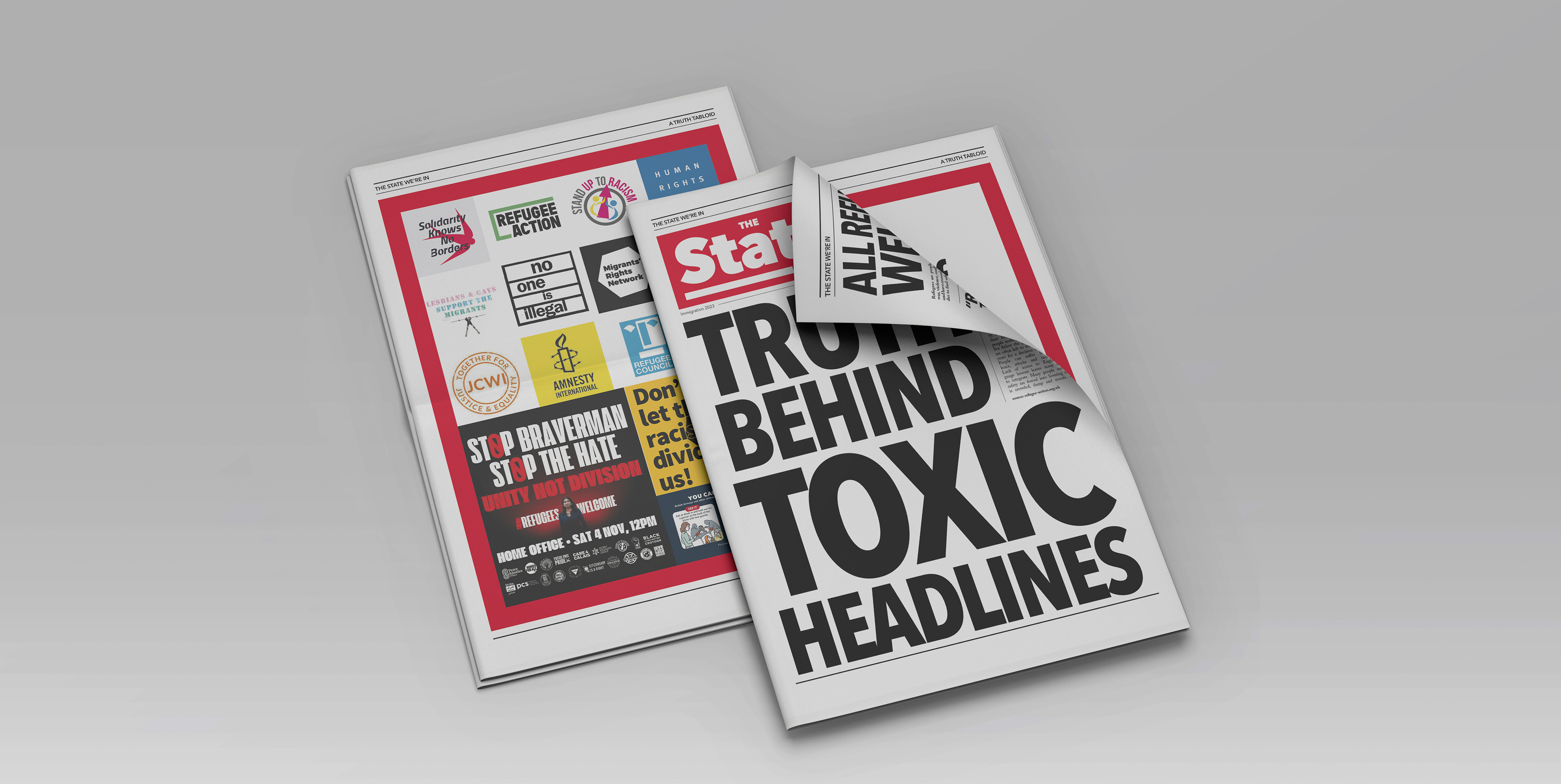
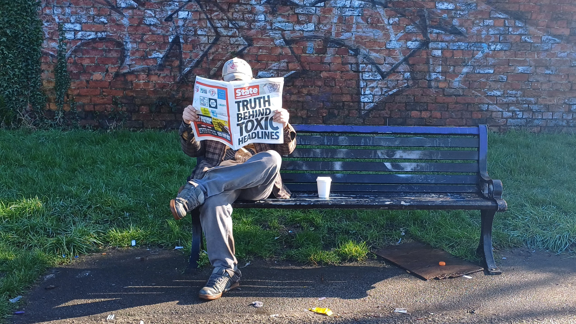
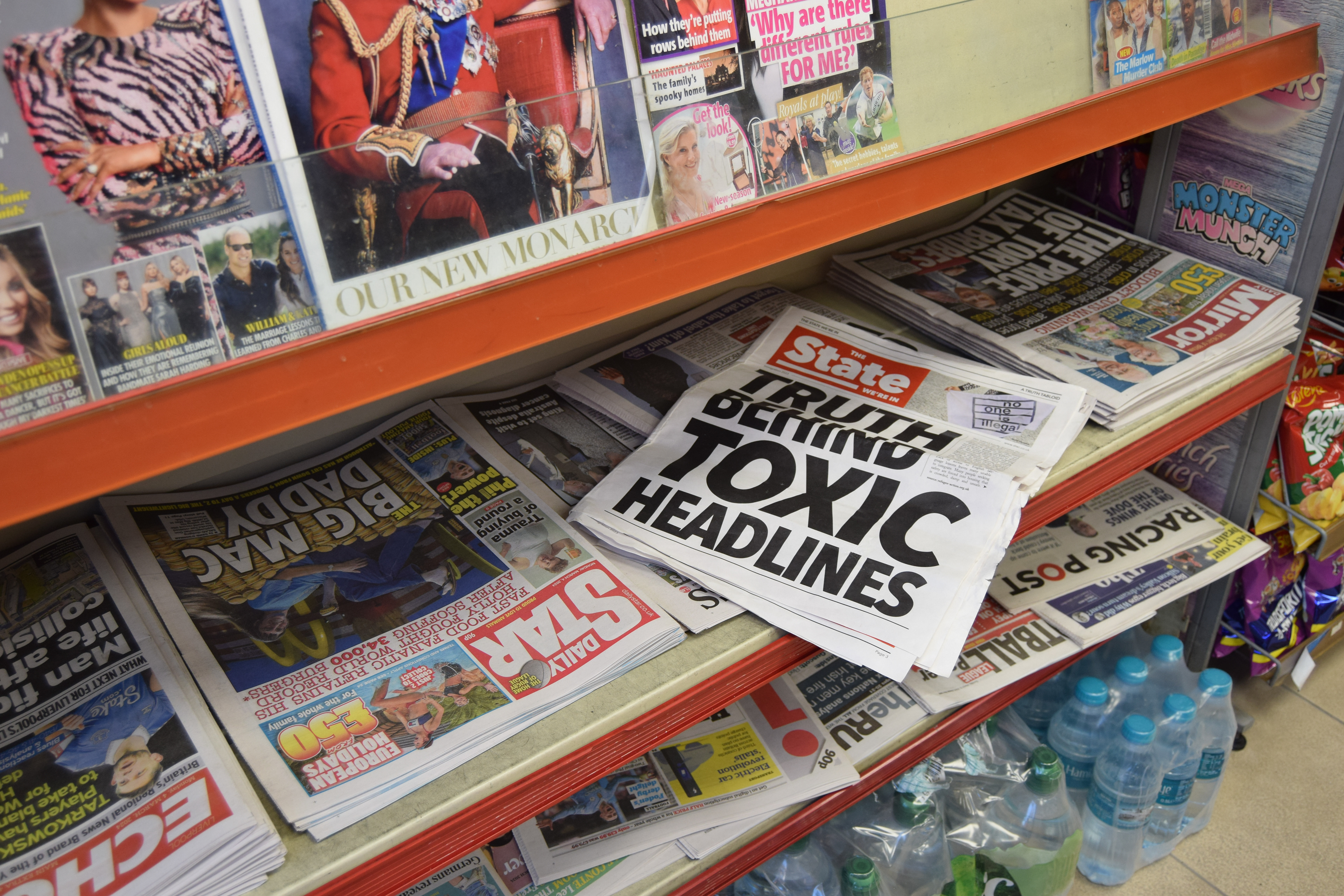
In response, I curated and designed THE STATE WE’RE IN, a satirical newspaper criticising the misinformation spread by UK tabloids.
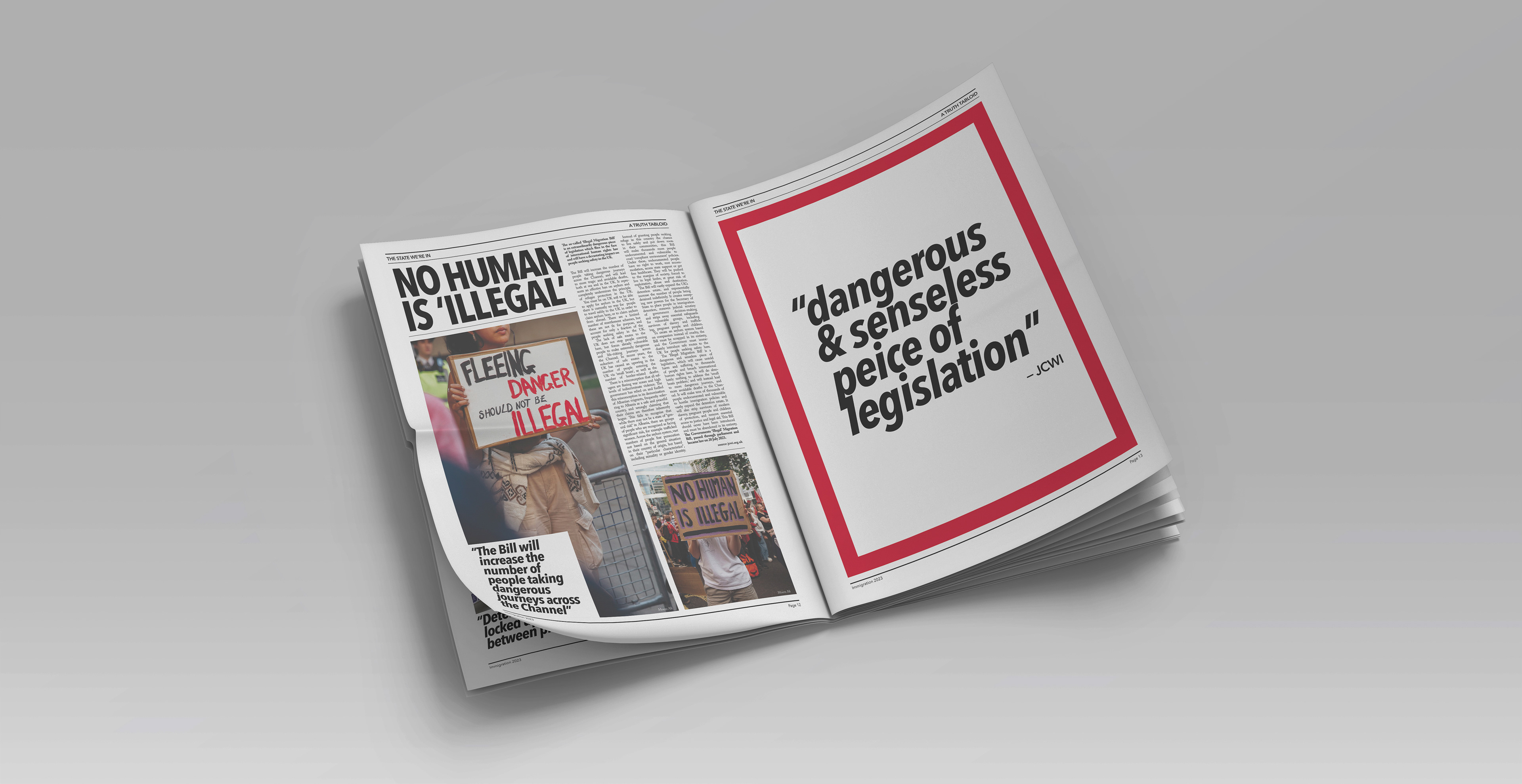
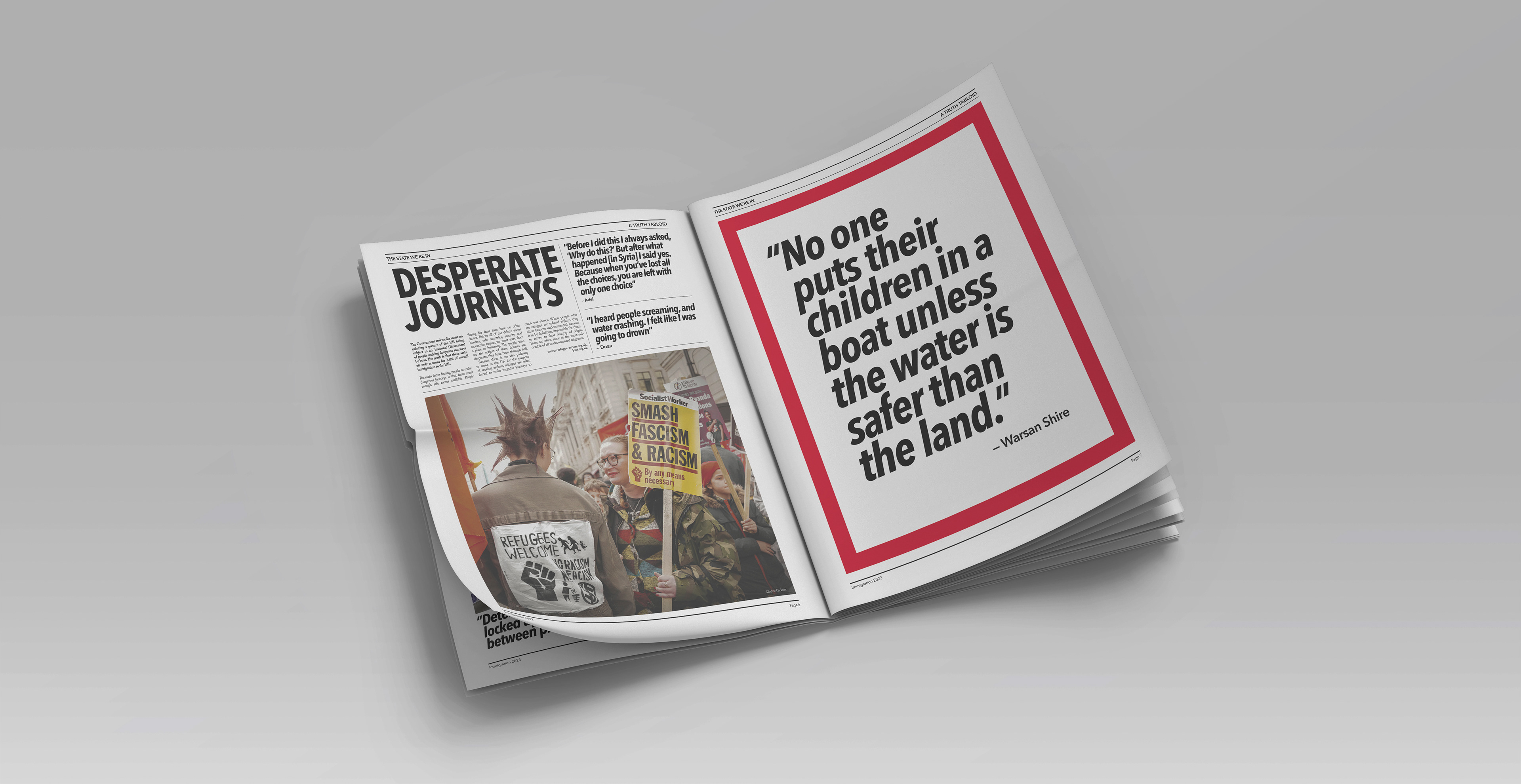
The publication is an explanation of the inhumane government policies on immigration and the difficulties faced by refugees and asylum seekers coming to the UK.
All design elements and typographic layout were chosen to emulate the visual style of newspapers. The content is a direct opposite of the visual design, it includes real human stories and an accompanying ‘Survival Game’ app helps the audience to understand different peoples experiences with sympathy and compassion.
