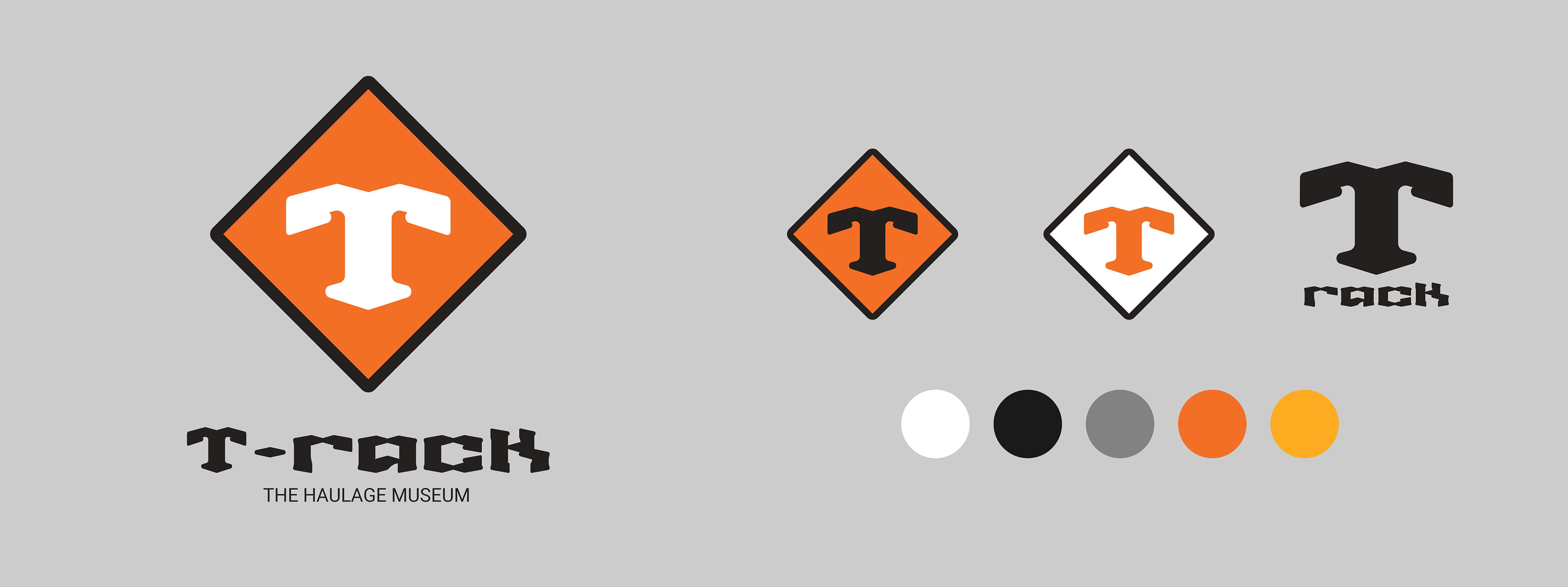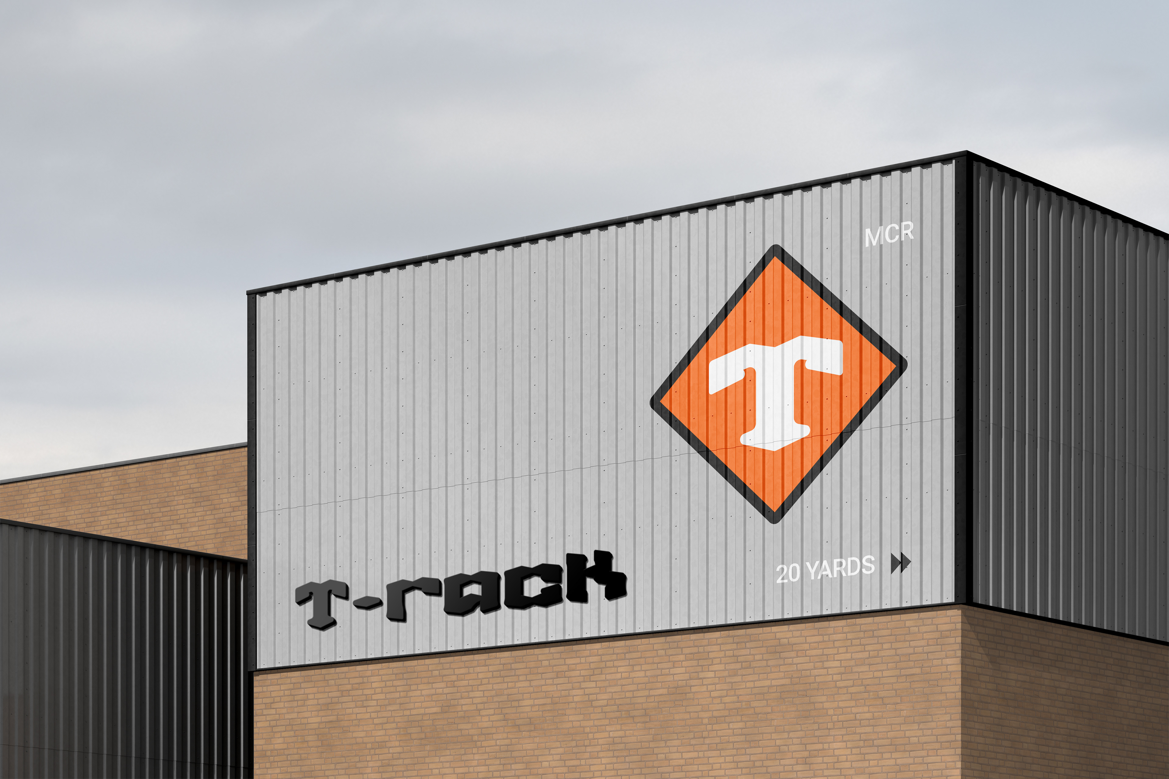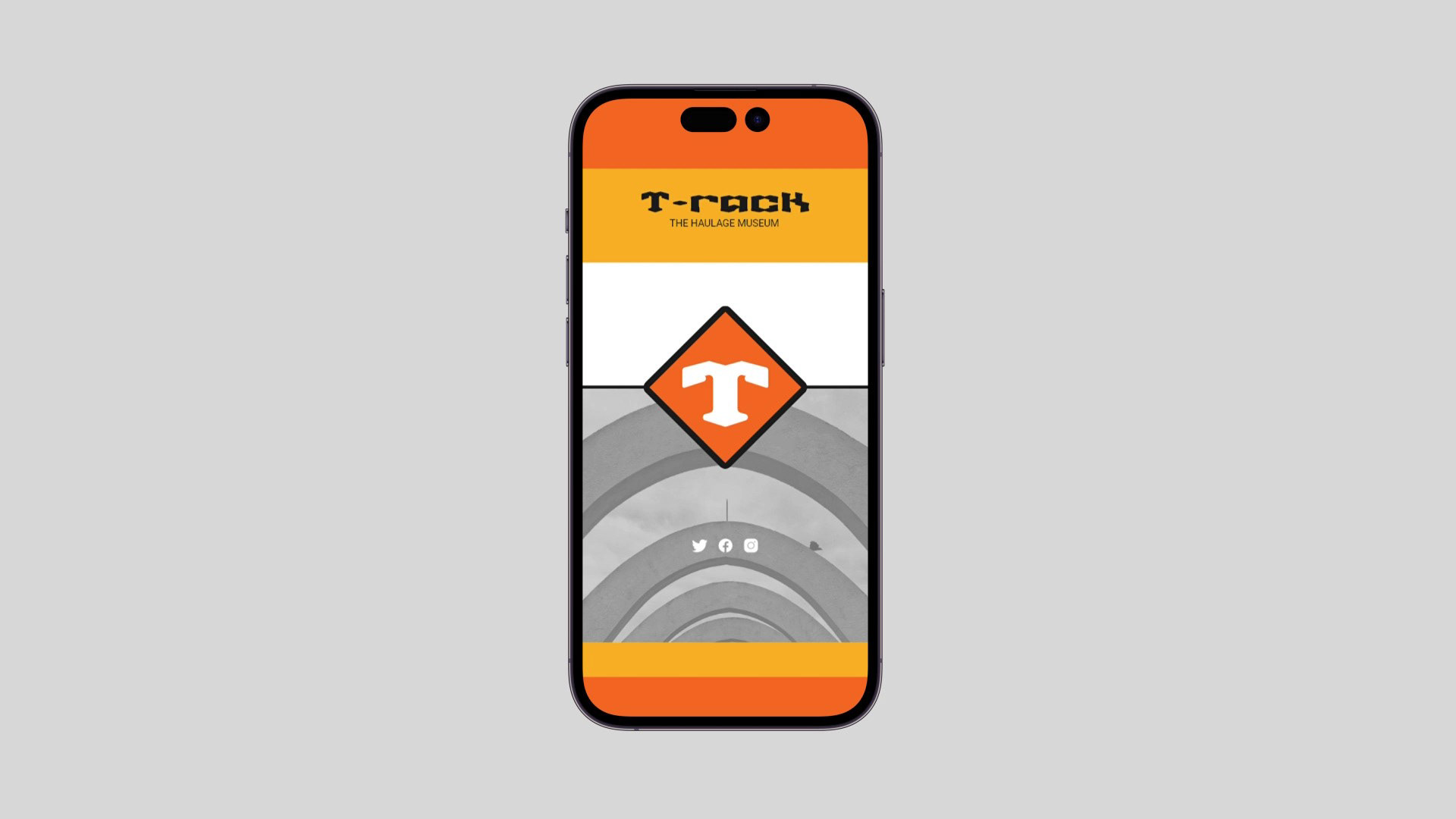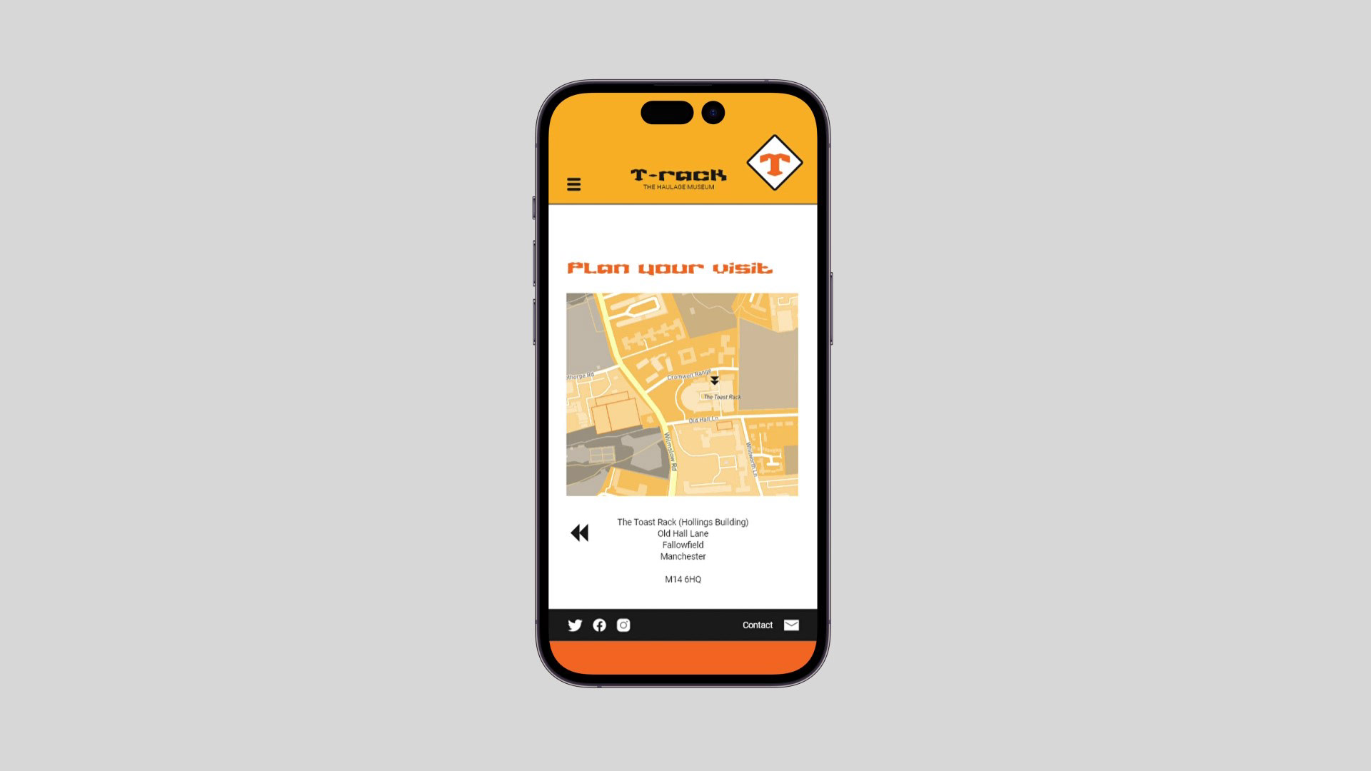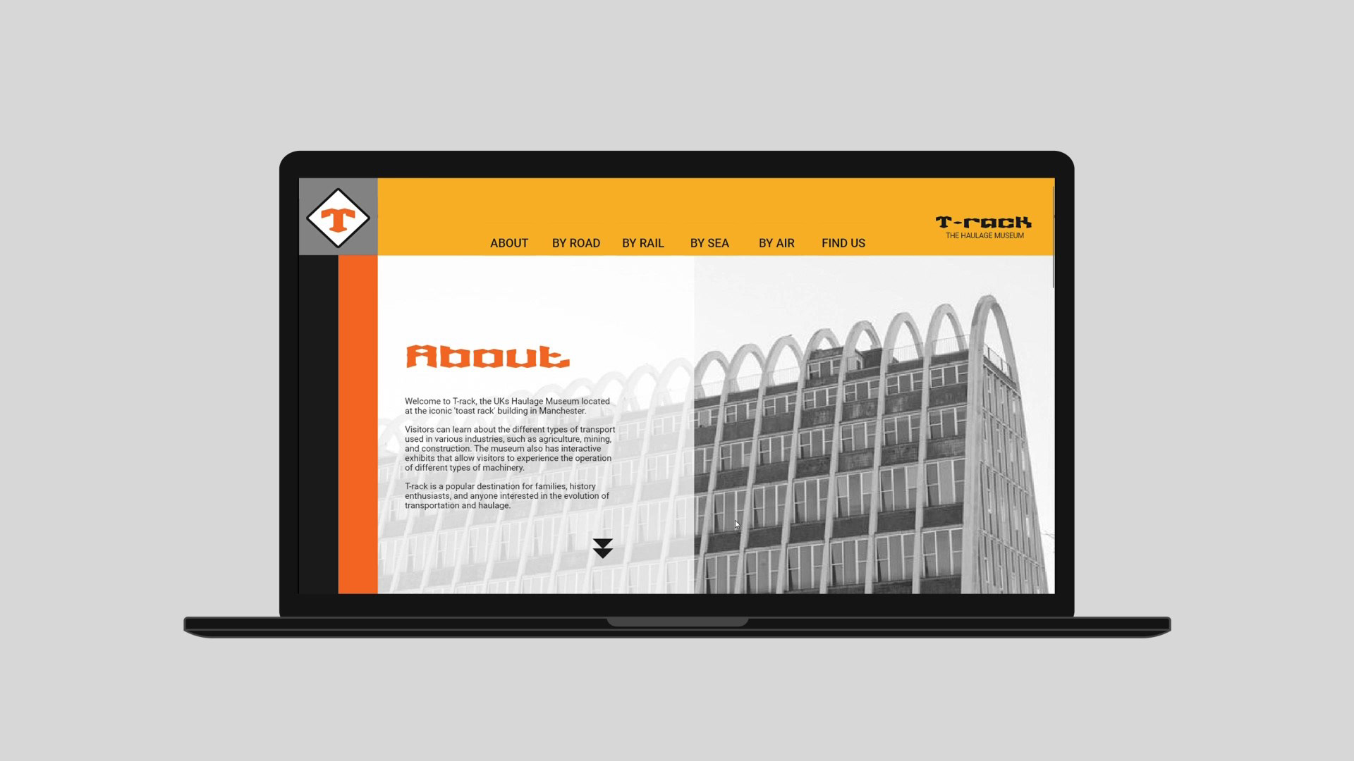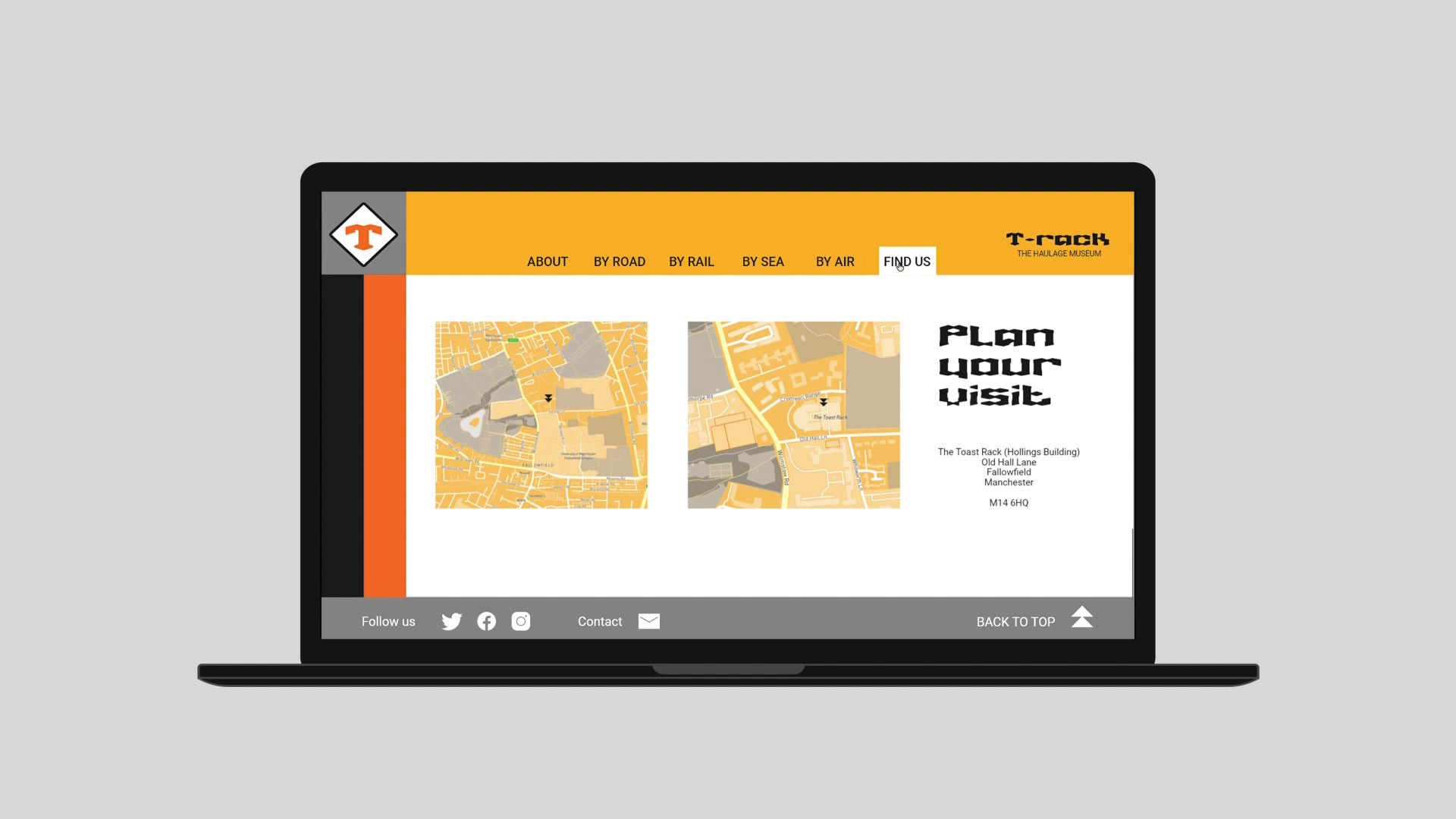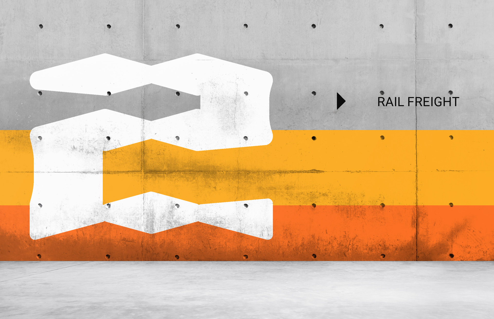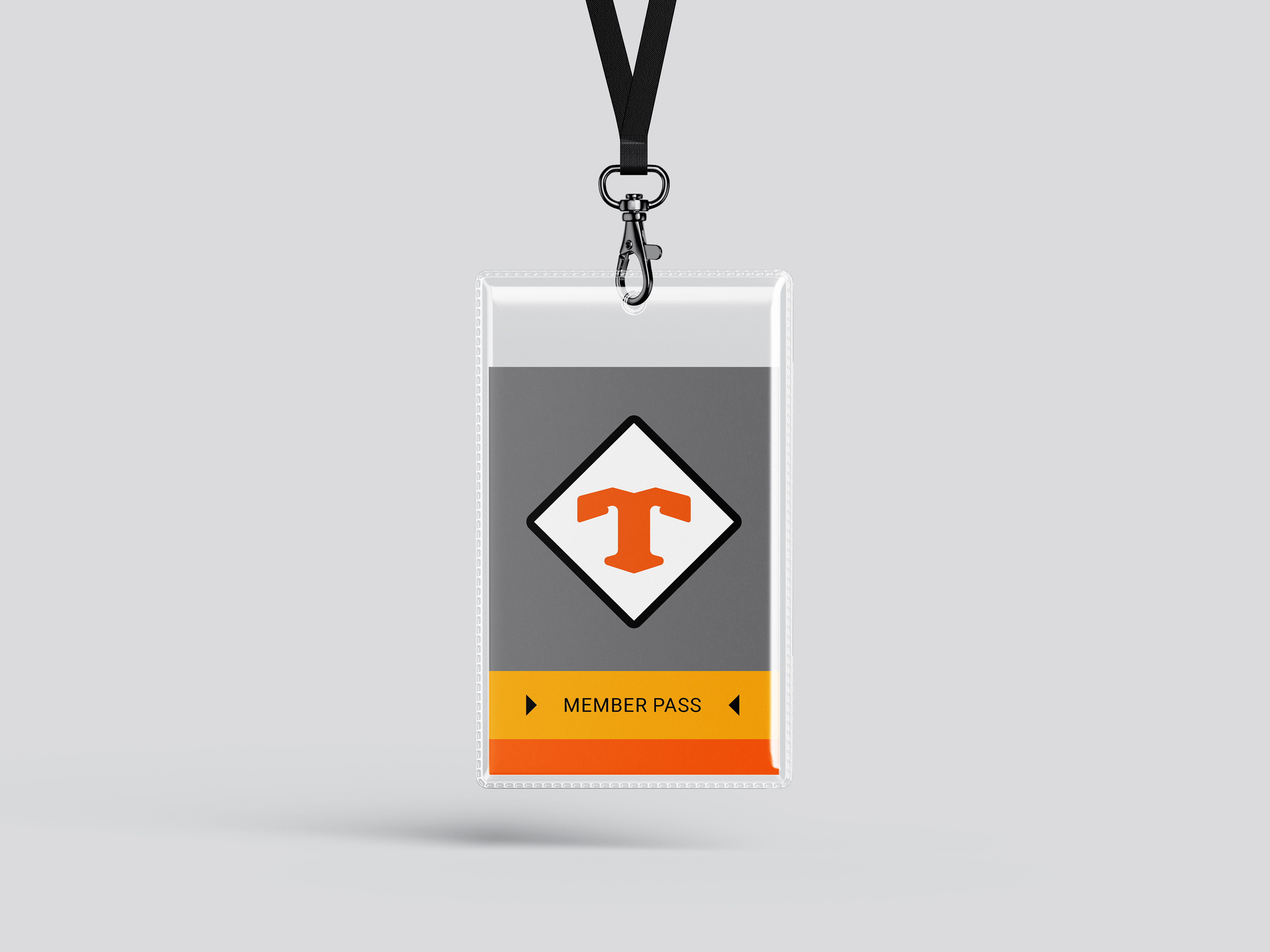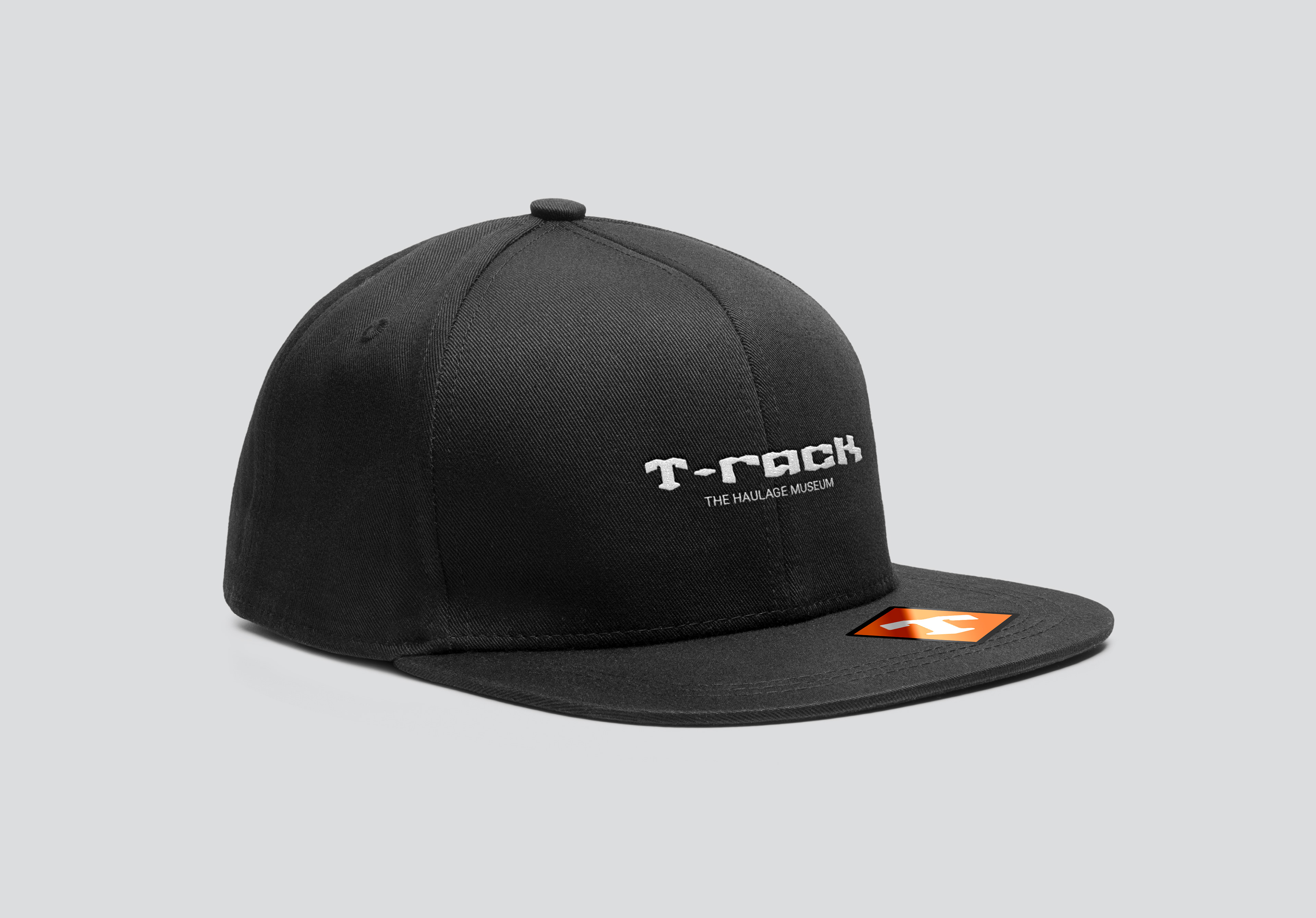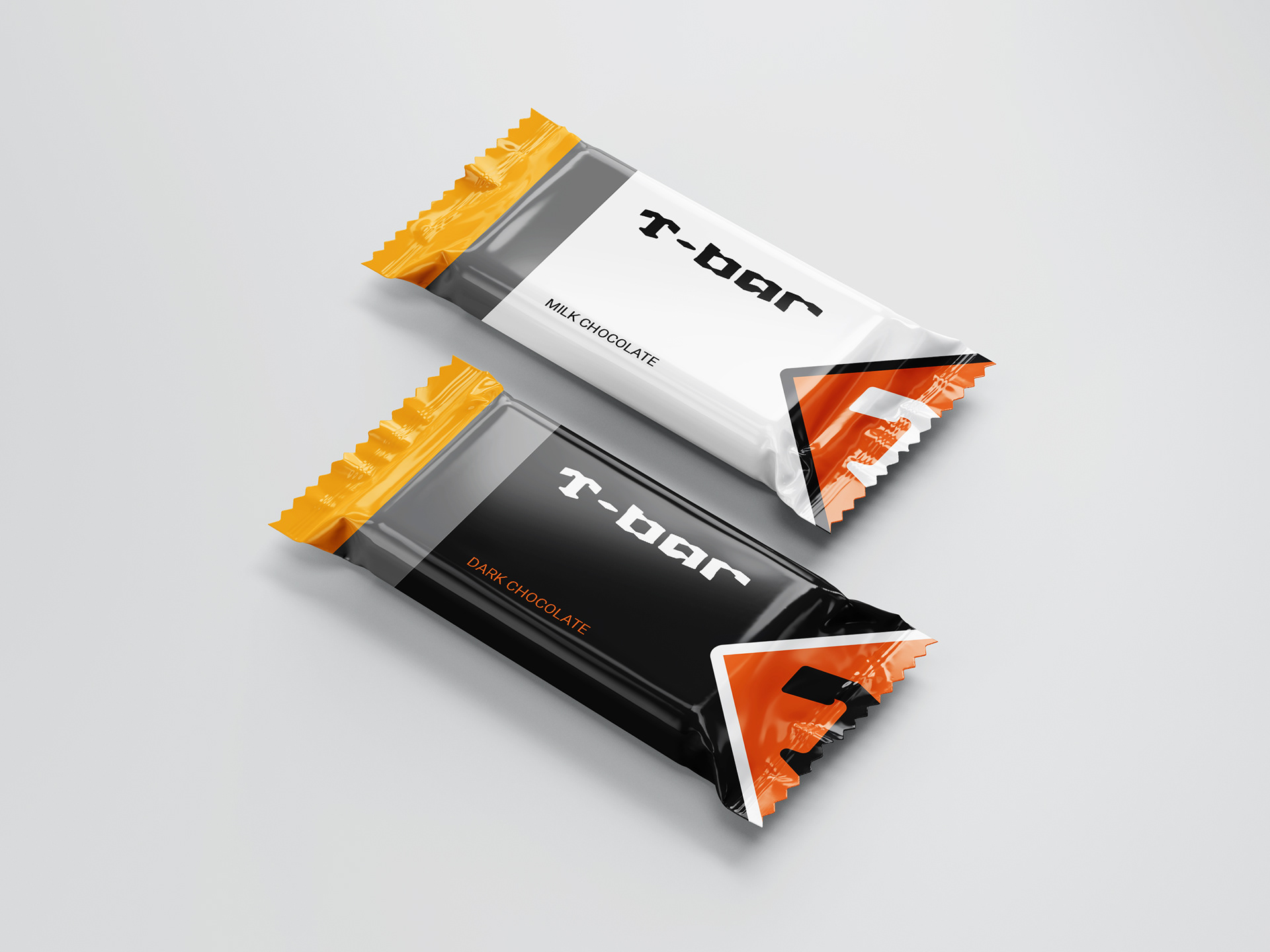
The challenge was to design a Brand Identity for a haulage museum located at Manchester’s ‘toast rack’ building. Shape elements and colours were chosen to echo existing road & rail freight safety labelling. The museums naming of T-rack is a play on words that helps connect the museum to its iconic location.
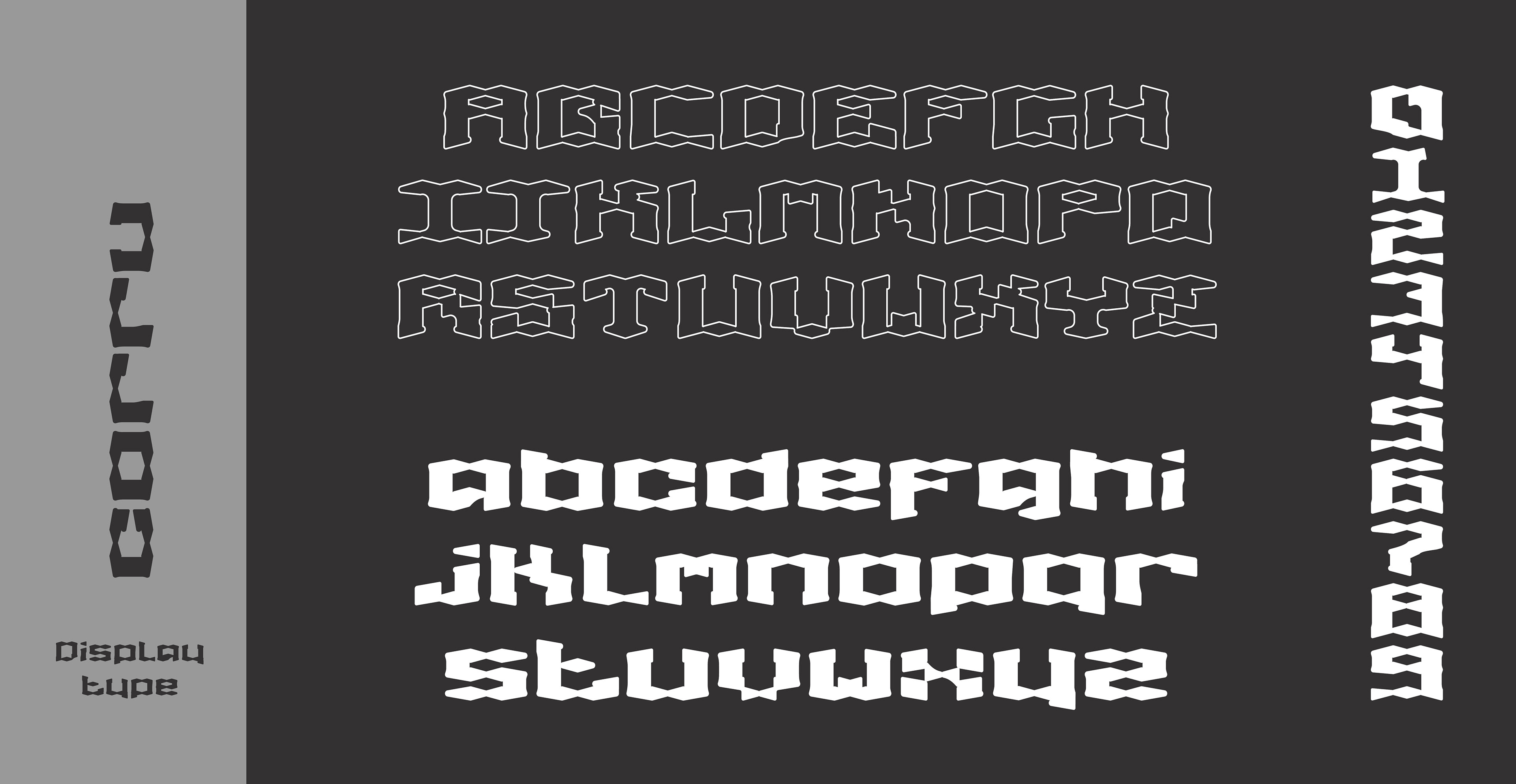
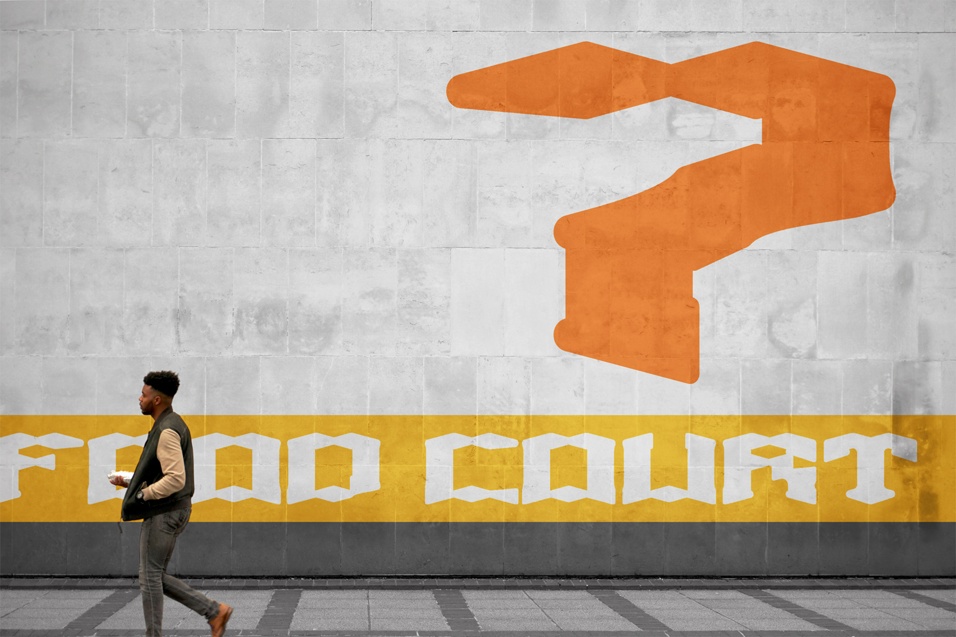
I developed a modular typeface as part of this identity, which is used within the logo and wordmarks, but also works well at large scale for wayfinding & signage. The typeface Corru was inspired by the buildings architecture and the corrugated nature of shipping containers.